

The landscape of data science and exploratory programming has long been dominated by traditional notebook environments such as Jupyter. While these tools have served as the bedrock for computational research and rapid prototyping for over a decade, practitioners frequently encounter systemic friction points. Out-of-order cell execution, hidden state mutations, and fragile synchronization between data pipelines and visual outputs routinely complicate the reproducibility of analytical workflows. Furthermore, transitioning from a static research notebook to a functional, client-facing dashboard historically required abandoning the notebook paradigm entirely in favor of dedicated web frameworks like Streamlit, Dash, or Shiny.
To address these longstanding architectural limitations, the open-source community has increasingly turned toward reactive programming paradigms. Among the emerging alternatives, Marimo has positioned itself as a modern, Python-native solution designed specifically to bridge the gap between ad-hoc data exploration and interactive application deployment. By enforcing reactive execution—where dependent computational cells update automatically upon state changes—and storing notebooks as standard, human-readable Python scripts rather than JSON-based .ipynb payloads, Marimo offers a streamlined methodology for developers, data scientists, and analysts alike.
Background and Evolution of Reactive Notebooks
The concept of reactive computing is not entirely new to software engineering, having proven its efficacy in modern frontend web frameworks like React and Vue. However, integrating reactivity into computational notebooks represents a significant departure from the imperative execution model popularized by IPython. In a traditional Jupyter notebook, the execution state relies heavily on the temporal order in which a user manually triggers cells. This design frequently results in "ghost states," where variables modified earlier in the session retain values that do not correspond to the current visual layout of the document.
Marimo was developed to eliminate these execution anomalies by building a static analysis engine directly into the notebook runtime. The system parses Python Abstract Syntax Trees (AST) to track variable dependencies across cells. Consequently, when a UI element or input variable is modified, the Marimo runtime computes an optimized directed acyclic graph (DAG) and automatically propagates updates to all downstream dependent cells. This architectural choice ensures that the displayed output is mathematically guaranteed to be consistent with the underlying code.

Furthermore, the decision to serialize notebooks as standard .py files resolves critical version control challenges that have frustrated software engineering teams for years. Traditional JSON notebooks notoriously pollute Git commit histories with metadata, output blobs, and execution counts, complicating code reviews and pull requests. By leveraging pure Python source files, Marimo enables seamless diffing, standard linting, formatting via tools like Black or Ruff, and effortless modularization.
Environment Setup and Installation Protocols
Deploying Marimo within a Python environment is engineered to be frictionless, integrating smoothly with standard package management utilities. The core library, along with essential data manipulation and visualization dependencies, can be provisioned via the Python Package Index (PyPI) or alternative package managers such as Conda and uv.
To initiate an environment optimized for data analysis, practitioners typically execute a unified installation command in their terminal interface:
pip install marimo pandas altairFor data professionals requiring a broader toolkit out of the box, Marimo provides an extended installation profile (pip install marimo[recommended]) that bundles high-performance data engines and visualization libraries, including DuckDB, Polars, and Altair. Once installed, initializing a reactive workspace does not require launching a complex server daemon or managing a separate browser-based service architecture. Instead, developers invoke the editing environment directly from the command line:
python -m marimo edit analysis.pyThis command instantiates a local development server and opens the Marimo Integrated Development Environment (IDE) within the user’s default web browser. The interface provides a clean, distraction-free canvas where code cells, markdown documentation, and interactive UI widgets coexist natively.
Data Generation and Automated Inspection Workflows
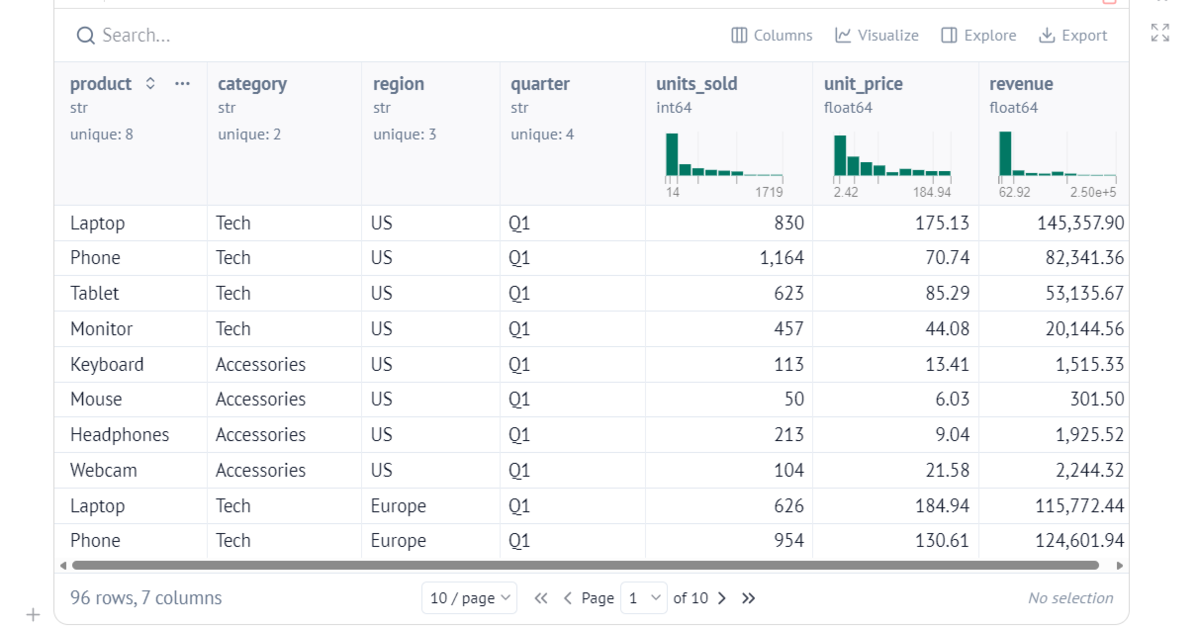
To evaluate the efficacy of a reactive dashboarding workflow, analysts require representative datasets that simulate real-world transactional complexity. In a standard data science pipeline, generating and inspecting multi-dimensional dataframes often necessitates boilerplate code dedicated to pagination, summary statistics, or terminal print statements.
Using Marimo, the generation of a comprehensive sales dataset—encompassing product categories, geographical regions, fiscal quarters, unit volumes, and pricing tiers—can be efficiently structured within a single Python cell:
import altair as alt
import numpy as np
import pandas as pd
import marimo as mo

rng = np.random.default_rng(42)

products = [
    ("Laptop", "Tech", 800, 1500),
    ("Phone", "Tech", 500, 1200),
    ("Tablet", "Tech", 250, 800),
    ("Monitor", "Tech", 150, 600),
    ("Keyboard", "Accessories", 30, 150),
    ("Mouse", "Accessories", 15, 90),
    ("Headphones", "Accessories", 50, 400),
    ("Webcam", "Accessories", 40, 250),
]
regions = ["US", "Europe", "Asia"]
region_scale = "US": 1.0, "Europe": 0.75, "Asia": 0.55
quarters = ["Q1", "Q2", "Q3", "Q4"]

rows = []
for _quarter in quarters:
    for _region in regions:
        for _name, _category, _lo, _hi in products:
            units_sold = int(
                rng.integers(_lo, _hi) * region_scale[_region] * rng.uniform(0.7, 1.3)
            )
            unit_price = round(rng.uniform(_lo, _hi) / 8, 2)
            rows.append(

                    "product": _name,
                    "category": _category,
                    "region": _region,
                    "quarter": _quarter,
                    "units_sold": units_sold,
                    "unit_price": unit_price,
                    "revenue": round(units_sold * unit_price, 2),

            )

df = pd.DataFrame(rows)
df
A distinguishing characteristic of the Marimo runtime is its native handling of dataframe objects. By simply concluding a cell with the dataframe variable df, Marimo automatically renders an interactive, feature-rich tabular interface. Users can sort columns, execute text searches, and filter records directly within the browser view without writing explicit display logic or importing auxiliary UI libraries. This out-of-the-box interactivity extends seamlessly to both Pandas and Polars data structures, accommodating diverse enterprise data stacks.
Integrating Reactive UI Controls and Data Filtering
The true utility of a reactive notebook emerges when static datasets are coupled with dynamic user interface (UI) elements. Marimo provides a robust suite of built-in UI components—including sliders, dropdown menus, checkboxes, file uploaders, and text inputs—that are treated as first-class reactive variables within the Python environment.
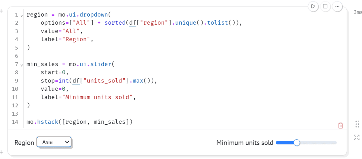
To construct an analytical filter mechanism, developers instantiate UI elements and group them layout-wise using layout containers such as horizontal stacks (mo.hstack):
region = mo.ui.dropdown(
    options=["All"] + sorted(df["region"].unique().tolist()),
    value="All",
    label="Region",
)

min_sales = mo.ui.slider(
    start=0,
    stop=int(df["units_sold"].max()),
    value=0,
    label="Minimum units sold",
)

mo.hstack([region, min_sales])
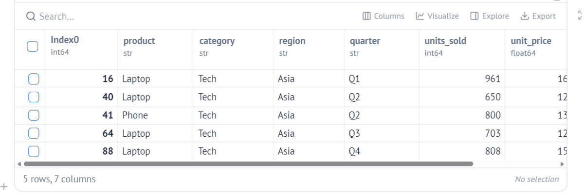
These UI components actively monitor user interactions. When a user adjusts the slider threshold or selects a specific geographic market from the dropdown, Marimo’s dependency graph immediately identifies that downstream data transformations rely on region.value and min_sales.value.
Consequently, the subsequent data-filtering cell executes automatically:
filtered_df = df[df["units_sold"] >= min_sales.value]

if region.value != "All":
    filtered_df = filtered_df[
        filtered_df["region"] == region.value
    ]

mo.ui.table(filtered_df)
This automatic propagation eliminates the cognitive overhead and time loss associated with manually re-running sequential cells in traditional analytical environments. The underlying logic remains clean, imperative Python, while the runtime orchestrates the event-driven execution flow behind the scenes.
Dynamic Data Visualization with Altair
Data exploration rarely relies solely on tabular displays; visual representations are critical for communicating insights and identifying market trends. Marimo integrates fluidly with leading Python visualization ecosystems, including Matplotlib, Seaborn, Plotly, HoloViews, and Altair.
By leveraging Altair’s declarative grammar of graphics, analysts can bind visualizations directly to the dynamically filtered dataframe (filtered_df). Because the dataframe itself updates reactively based on UI control inputs, any chart referencing that dataframe updates in real time:
chart = (
    alt.Chart(filtered_df)
    .mark_bar()
    .encode(
        x="product:N",
        y="units_sold:Q",
        color="region:N",
        tooltip=["product", "region", "quarter", "units_sold", "revenue"],
    )
    .properties(width=600, height=350)
)

chart
In this architecture, modifying the region dropdown or adjusting the sales volume slider instantly refreshes both the summary data table and the graphical bar chart. Furthermore, advanced configurations allow selection states from supported visualization libraries to be passed back into Python variables, enabling bidirectional interaction models that rival purpose-built web applications.
Transitioning from Research Notebook to Production Application
One of the most friction-prone challenges in data science workflows is the deployment phase. Historically, sharing an exploratory analysis with stakeholders required either exporting static PDF reports, deploying heavy JupyterHub infrastructure, or rewriting the analysis code into an entirely separate framework such as Streamlit or FastAPI.
Marimo solves this architectural divide by allowing the exact same notebook file to serve dual purposes: an interactive development environment and a read-only production application. By executing a single command in the terminal, the development server shifts operational modes:
python -m marimo run analysis.pyIn application mode (run), Marimo strips away the underlying Python code cells, editors, and debugging interfaces, presenting solely the formatted markdown, interactive UI widgets, tables, and visualizations as a cohesive web dashboard.

+-------------------------------------------------------------+
|                      MARIMO ECOSYSTEM                       |
+------------------------------+------------------------------+
|   Development Mode           |   Application Mode           |
|   (python -m marimo edit)    |   (python -m marimo run)     |
+------------------------------+------------------------------+
| - Full Python Code Editor    | - Clean, Read-Only UI        |
| - Reactive AST Dependency    | - Hidden Source Code         |
| - Interactive Data Tables    | - Stakeholder-Ready Dashboard|
+------------------------------+------------------------------+
This capability fundamentally alters the deployment lifecycle for internal tooling and rapid prototyping. Data practitioners can build, test, and refine analytical models using standard exploratory workflows, and instantly deliver secure, interactive data products to business units without writing boilerplate frontend code or configuring complex containerization pipelines.
Broader Implications and Industry Impact
The adoption of reactive notebook architectures like Marimo reflects a broader maturation in the tooling expectations of data science and software engineering teams. As organizations demand faster time-to-insight and higher standards of code reproducibility, traditional paradigms that tolerate hidden states and manual execution order are increasingly viewed as technical debt liabilities.
By aligning notebook infrastructure with software engineering best practices—such as pure Python file serialization, static code analysis, and native Git compatibility—Marimo lowers the barrier to robust software craftsmanship in exploratory research. Moreover, the ability to bypass auxiliary web frameworks when deploying lightweight analytical dashboards significantly reduces the cognitive load and maintenance burden on data engineering organizations.
Ultimately, tools that streamline the continuum between initial data exploration and stakeholder communication enable teams to focus less on infrastructure orchestration and more on empirical discovery. As reactive computing models continue to gain traction across the computational sciences, environments that successfully harmonize exploratory flexibility with production-grade reliability will define the standard for modern data analysis.