
The initial phase of any robust data analysis project invariably begins with an intimate understanding of the dataset at hand. Data professionals universally encounter the same fundamental questions: What is the overall structure and dimension of the data? Which columns represent quantitative measures, and which are categorical descriptors? What is the extent and pattern of missing information? Are there any significant outliers or strong skewness in the distributions that warrant attention? Traditionally, these crucial inquiries have been addressed through a repetitive cycle of manual execution, involving familiar Python snippets like df.describe(), df.isna().sum(), and df.groupby(...).agg(...). The output of these commands often necessitates further manual reformatting before it can be integrated into reports, representing a significant expenditure of time and effort that could be more effectively allocated.
This article explores a transformative shift in the data analysis workflow, moving beyond these laborious, one-off tasks towards the implementation of repeatable, automated pipelines. The contemporary Python ecosystem now offers a sophisticated suite of tools capable of generating comprehensive, formatted, and shareable summary tables from raw DataFrames with minimal code. This includes specialized libraries designed to produce the "Table 1" format widely adopted in academic and clinical research. By outlining a seven-step methodology, this guide aims to equip data practitioners with the knowledge to construct an efficient and consistent data exploration framework. Throughout this exploration, the widely used Palmer Penguins dataset will serve as a practical example. Its manageable size, open availability, realistic blend of numeric and categorical features, presence of genuine missing values, and a natural grouping variable (species) make it an ideal candidate for demonstrating the capabilities of these automation techniques.
The Foundational Challenge in Data Analysis: Manual Exploration Bottlenecks
Initial data exploration, often referred to as Exploratory Data Analysis (EDA), is a cornerstone of any data-driven endeavor. It is the process of critically examining data to discover patterns, spot anomalies, test hypotheses, and check assumptions with the help of summary statistics and graphical representations. However, the manual execution of EDA, while providing granular control, is prone to human error and can become a significant bottleneck in projects with numerous datasets or iterative analysis requirements. Data analysts frequently spend considerable time writing boilerplate code to derive basic descriptive statistics, and then even more time massaging these outputs into a presentable format for stakeholders or internal documentation. This not only diminishes productivity but also introduces inconsistencies across reports if standard practices are not strictly enforced. The imperative for automation stems from the need to streamline this repetitive yet critical phase, ensuring accuracy, consistency, and efficiency, thereby freeing analysts to focus on deeper insights and complex problem-solving.
Setting the Stage: Environment and Data Acquisition for Repeatable Analysis
The first step in building an automated descriptive statistics pipeline is to establish a robust and consistent Python environment. This involves installing the necessary libraries that extend Python’s core data handling capabilities. For this tutorial, the following packages are essential: pandas for fundamental data manipulation, seaborn for convenient dataset loading and potential visualization, skimpy for rich console summaries, tableone for generating publication-quality research tables, great-tables for sophisticated table styling and presentation, and fg-data-profiling for comprehensive, interactive data profiling reports.
A notable point of attention for fg-data-profiling concerns its naming evolution. This popular profiling library has undergone several name changes, reflecting its development and transitions within the open-source community. Initially known as pandas-profiling, it was rebranded to ydata-profiling in 2023. More recently, in April 2026, it adopted its current name, fg-data-profiling. While older installations of ydata-profiling may still function, it is crucial for new projects to prioritize fg-data-profiling to ensure access to ongoing updates, bug fixes, and new features, maintaining the integrity and security of the analytical pipeline.
Once the environment is configured, the next step is to load the dataset. The Palmer Penguins dataset, chosen for its representative characteristics, can be conveniently accessed through the seaborn library, eliminating the need for manual downloads. The initial inspection of the loaded DataFrame provides critical insights into its structure:
import pandas as pd
import seaborn as sns

df = sns.load_dataset("penguins")
print(df.shape)
print(df.dtypes)
print(df.isna().sum())
The output reveals a DataFrame comprising 344 rows and 7 columns. The data types indicate three categorical columns (species, island, sex) and four numeric measurements (bill_length_mm, bill_depth_mm, flipper_length_mm, body_mass_g). A crucial observation from the isna().sum() output is the presence of missing values: two for each numeric measurement column and eleven for the sex column. This detail is significant, as it will allow for an assessment of how each descriptive statistics tool handles and reports missing data, a fundamental aspect of data quality assessment.
(344, 7)
species               object
island                object
bill_length_mm       float64
bill_depth_mm        float64
flipper_length_mm    float64
body_mass_g          float64
sex                   object
dtype: object
species               0
island                0
bill_length_mm        2
bill_depth_mm         2
flipper_length_mm     2
body_mass_g           2
sex                  11
dtype: int64
Evolving Data Summarization: From Basic Pandas to Enhanced Capabilities
The journey towards automated descriptive statistics often begins with the familiar, built-in functionalities of the Pandas library, which form the bedrock of data manipulation in Python.
The Baseline: Pandas df.describe() and Its Limitations
Pandas’ describe() method is an almost instantaneous and universally accessible starting point for obtaining a quick statistical summary of a DataFrame. Requiring no additional installations, it provides a rapid overview of numerical columns, including count, mean, standard deviation, minimum, maximum, and the interquartile range (25th, 50th, and 75th percentiles).
df.describe()The output, while genuinely useful for a preliminary "gut check," exhibits several blind spots that limit its utility for comprehensive reporting:
       bill_length_mm  bill_depth_mm  flipper_length_mm  body_mass_g
count          342.00         342.00             342.00       342.00
mean            43.92          17.15             200.92      4201.75
std              5.46           1.97              14.06       801.95
min             32.10          13.10             172.00      2700.00
25%             39.22          15.60             190.00      3550.00
50%             44.45          17.30             197.00      4050.00
75%             48.50          18.70             213.00      4750.00
max             59.60          21.50             231.00      6300.00
By default, describe() entirely ignores categorical columns, providing no insights into their unique values, frequencies, or modes. While it reports the count of non-null values, it does not directly present the percentage of missing data, which is often a more intuitive metric for data quality assessment. Furthermore, its statistical summary is limited to the five-number summary (min, 25%, 50%, 75%, max) and basic measures like mean and standard deviation, omitting crucial metrics like skewness and kurtosis. These higher-order moments are vital for understanding the shape and symmetry of a distribution, which can have profound implications for subsequent modeling and hypothesis testing. For a foundational report, these omissions leave significant gaps in the descriptive narrative of the data.
Pushing Pandas Further: include, .agg(), and groupby for Deeper Insights
Before resorting to external libraries, it is prudent to leverage the full capabilities of Pandas, as it can address a substantial portion of everyday reporting needs. The library offers powerful methods to overcome the inherent limitations of df.describe().
First, to incorporate categorical columns into the summary, the include="all" argument can be used with describe():
df.describe(include="all").round(2)This simple addition transforms the output, providing unique, top, and freq for text-based columns alongside the numeric statistics. Cells where a statistic is not applicable are appropriately filled with NaN. This generates a unified table, offering a holistic view of all column types.
       species island  bill_length_mm  bill_depth_mm  flipper_length_mm  body_mass_g   sex
count      344    344          342.00         342.00             342.00      342.00   333
unique       3      3             NaN            NaN                NaN         NaN     2
top     Adelie Biscoe             NaN            NaN                NaN         NaN  Male
freq       152    168             NaN            NaN                NaN         NaN   168
mean       NaN    NaN           43.92          17.15             200.92     4201.75   NaN
std        NaN    NaN            5.46           1.97              14.06      801.95   NaN
min        NaN    NaN           32.10          13.10             172.00     2700.00   NaN
25%        NaN    NaN           39.22          15.60             190.00      3550.00   NaN
50%        NaN    NaN           44.45          17.30             197.00      4050.00   NaN
75%        NaN    NaN           48.50          18.70             213.00      4750.00   NaN
max        NaN    NaN           59.60          21.50             231.00      6300.00   NaN
Second, for complete control over the reported statistics, including those describe() omits, a custom summary can be constructed using the .agg() method. This allows for the calculation of skewness and kurtosis, which are critical for understanding the symmetry and tailedness of distributions. Additionally, a missing-data percentage can be seamlessly integrated:
numeric = df.select_dtypes("number")

summary = numeric.agg(["mean", "median", "std", "skew", "kurt"]).T
summary["missing_pct"] = df[numeric.columns].isna().mean().mul(100).round(1)
summary.round(2)
This approach yields a tailored summary, providing a more comprehensive statistical profile for numeric variables:
                      mean   median     std  skew  kurt  missing_pct
bill_length_mm       43.92    44.45    5.46  0.05 -0.88          0.6
bill_depth_mm        17.15    17.30    1.97 -0.14 -0.91          0.6
flipper_length_mm   200.92   197.00   14.06  0.35 -0.98          0.6
body_mass_g        4201.75  4050.00  801.95  0.47 -0.72          0.6
Third, and often overlooked, is the ability to chain groupby() directly with describe() to generate stratified summaries. This is immensely powerful for comparing characteristics across different subgroups within the dataset, such as penguin species in this example:
df.groupby("species")["body_mass_g"].describe().round(1)This single line produces a comparative statistical overview of body_mass_g for each species:
           count    mean    std     min     25%     50%     75%     max
species
Adelie     151.0  3700.7  458.6  2850.0  3350.0  3700.0  4000.0  4775.0
Chinstrap   68.0  3733.1  384.3  2700.0  3487.5  3700.0  3950.0  4800.0
Gentoo     123.0  5076.0  504.1  3950.0  4700.0  5000.0  5500.0  6300.0
The underlying principle here is to internalize the pattern: select_dtypes for column selection, .agg([...]) for choosing specific statistics, and groupby for defining strata. This powerful trio within Pandas can fulfill a surprising proportion of real-world reporting requirements without introducing any external dependencies, laying a strong foundation for more advanced automation. The subsequent steps build upon this foundation by adding polish, addressing specialized reporting needs, and offering more integrated solutions.
Advanced Console Summaries: The Power of skimpy for Quick Insights
When the need for more detailed descriptive statistics surpasses the capabilities of df.describe() but without the overhead of generating a full HTML report, skimpy emerges as an ideal solution. This library provides a supercharged, console-friendly summary that handles all column types concurrently, working seamlessly with both Pandas and Polars DataFrames.
from skimpy import skim

skim(df)
A single invocation of skim(df) produces a comprehensive, structured report directly within the console or notebook environment. This report includes a concise data summary (detailing row and column counts), a breakdown of data types present, and separate tables for numeric and string columns. The numeric table offers a rich set of statistics, including mean, standard deviation, and a full percentile spread (p0, p25, p50, p75, p100). A standout feature is the inclusion of inline ASCII histograms for each numeric column, providing an immediate visual representation of the distribution shape without the need to invoke a separate plotting library. For string columns, skimpy reports on characteristics such as character counts, word counts, and the most/least frequent values. Crucially, missing data is explicitly reported as both a raw count and a percentage, placed intuitively where an analyst would expect to find it.
The inline histograms are a game-changer for interactive exploration. They allow analysts to quickly gauge the symmetry, modality, and presence of outliers in distributions, saving valuable time that would otherwise be spent generating and interpreting individual plots. skimpy thus occupies a valuable middle ground: it is significantly more informative than a basic describe() call yet considerably lighter and faster than a full interactive HTML profiling report, making it an excellent tool for rapid data understanding and interactive exploration during the initial phases of analysis.
Comprehensive Data Reporting: The Interactive fg-data-profiling
For scenarios demanding the most exhaustive understanding of a dataset, encompassing distributions, correlations, interactions, duplicate detection, and automated data-quality warnings, generating a full interactive profile report is the superior approach. This powerful one-liner has revolutionized the exploratory data analysis workflow for many analysts, condensing hours of manual plotting and data validation into a single, comprehensive output.
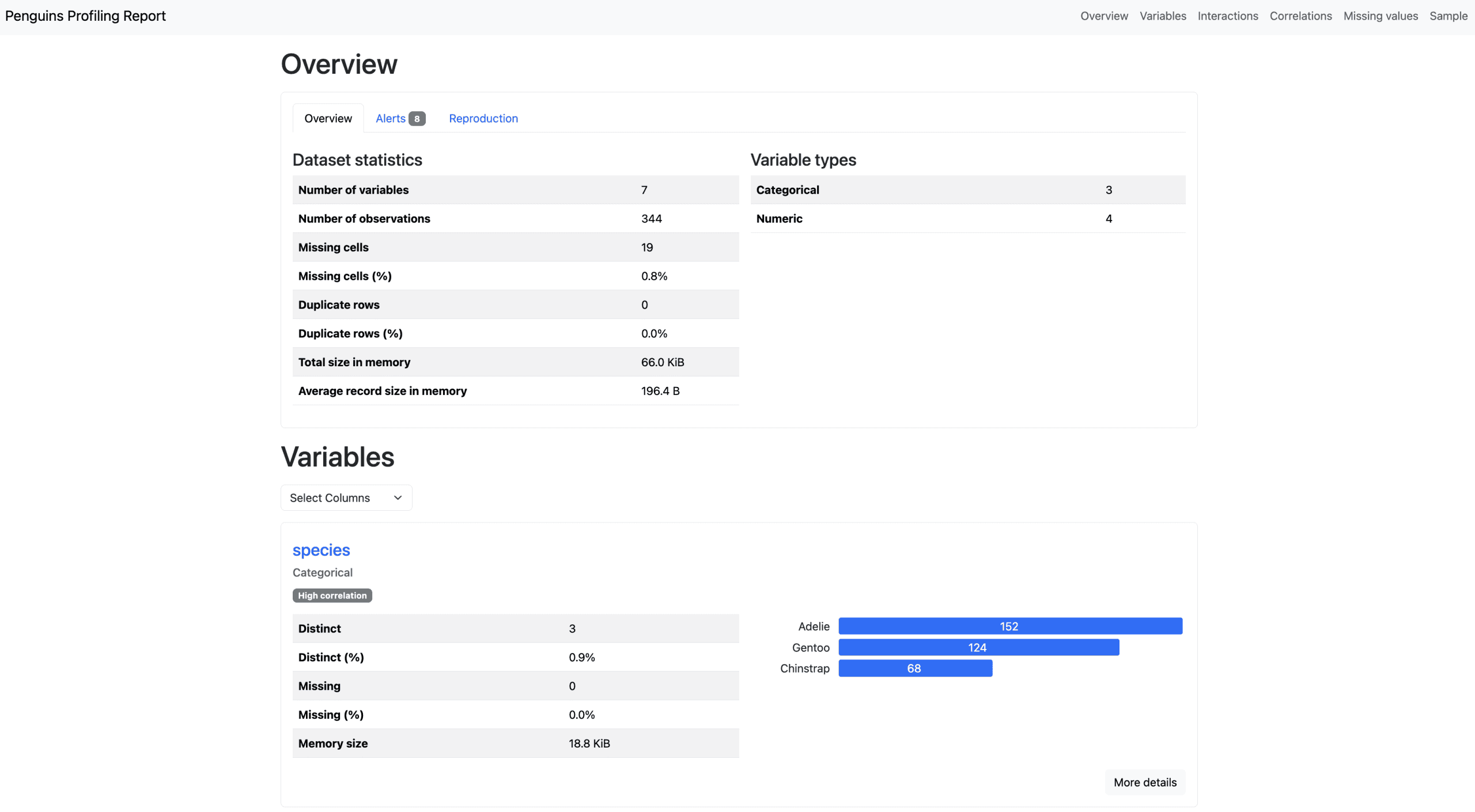
With the currently maintained package, fg-data-profiling, the process is straightforward:
from data_profiling import ProfileReport          # fg-data-profiling

profile = ProfileReport(df, title="Penguins Profiling Report", explorative=True)
profile.to_file("penguins_report.html")
For users on the legacy ydata-profiling package, only the import statement needs to be adjusted:
import ydata_profiling # legacy ydata-profilingThe output is a self-contained, interactive HTML file that provides a multi-faceted view of the dataset. It typically includes an overview section detailing the dataset’s size, memory footprint, and the presence of duplicate rows. Each variable receives a dedicated section, presenting comprehensive descriptive statistics alongside visually rich histograms, value counts, and insights into common values. Beyond individual variable analysis, the report delves into correlations across various coefficients (e.g., Pearson, Spearman, Kendall, Phik), a detailed analysis of missing values (including matrix, bar, and heatmap visualizations), and automatically flags potential data quality issues through alerts. These alerts can highlight highly skewed distributions, columns with high cardinality, constant columns, or other characteristics that might impact downstream analysis or modeling.
The interactive nature of the HTML report allows users to expand sections, explore details, and filter views, making it an invaluable resource for both technical and non-technical stakeholders. It facilitates a deeper understanding of the data’s nuances and potential pitfalls.
However, the depth of analysis provided by a full profile report comes with a computational cost, particularly for very large datasets. To mitigate performance concerns, especially during initial rapid prototyping or when working with extensive data, two key strategies can be employed. The minimal=True argument can be used to disable the most computationally intensive calculations, significantly speeding up report generation. Alternatively, profiling a judiciously chosen sample of the DataFrame (e.g., df.sample(frac=0.5)) can provide a representative feel for the data without processing the entire dataset.
Furthermore, fg-data-profiling includes a powerful .compare() method, which is invaluable for identifying data drift. This feature allows for a side-by-side comparison of two datasets, making it indispensable for tasks such as monitoring changes between a training dataset and production data, or analyzing shifts in data characteristics between different time periods. This capability is crucial for maintaining data quality in machine learning operations (MLOps) and ensuring the ongoing reliability of data-driven systems.
Publication-Ready Tables: tableone for Research and Clinical Reports
While the previously discussed tools excel at exploratory analysis and general reporting, tableone addresses a highly specialized need: the creation of baseline characteristics tables, famously known as "Table 1" in clinical and quantitative research papers. These tables adhere to stringent formatting and statistical reporting standards expected by peer reviewers and the scientific community.
from tableone import TableOne

data = df.dropna(subset=["sex"]) # Drop rows with missing 'sex' for accurate grouping

columns     = ["bill_length_mm", "bill_depth_mm",
               "flipper_length_mm", "body_mass_g", "island", "sex"]
categorical = ["island", "sex"]
nonnormal   = ["body_mass_g"]   # summarize with median [IQR] instead of mean (SD)

table1 = TableOne(
    data,
    columns=columns,
    categorical=categorical,
    nonnormal=nonnormal,
    groupby="species",
    pval=True,
    smd=True,
)
print(table1.tabulate(tablefmt="github"))
The tableone library meticulously formats output according to academic conventions: continuous variables are presented as mean (SD) (mean with standard deviation in parentheses), categorical variables as n (%) (count with percentage), and any variable flagged as non-normal (like body_mass_g in this example) is summarized using median [Q1, Q3] (median with interquartile range). Crucially, the table is stratified across a specified grouping variable (e.g., species), includes a dedicated column for missing data, and automatically calculates p-values and Standardized Mean Differences (SMD) between groups. P-values assess the statistical significance of differences between groups, while SMDs provide a measure of the effect size, indicating the magnitude of the difference independent of sample size.
|                              |           | Missing   | Overall                | Adelie                 | Chinstrap              | Gentoo                 | SMD (Adelie,Chinstrap)   | SMD (Adelie,Gentoo)   | SMD (Chinstrap,Gentoo)   | P-Value   |
|------------------------------|-----------|-----------|------------------------|------------------------|------------------------|------------------------|--------------------------|-----------------------|--------------------------|-----------|
| n                            |           |           | 333                    | 146                    | 68                     | 119                    |                          |                       |                          |           |
| bill_length_mm, mean (SD)    |           | 0         | 44.0 (5.5)             | 38.8 (2.7)             | 48.8 (3.3)             | 47.6 (3.1)             | 3.315                    | 3.023                 | -0.393                   | <0.001    |
| bill_depth_mm, mean (SD)     |           | 0         | 17.2 (2.0)             | 18.3 (1.2)             | 18.4 (1.1)             | 15.0 (1.0)             | 0.062                    | -3.022                | -3.220                   | <0.001    |
| flipper_length_mm, mean (SD) |           | 0         | 201.0 (14.0)           | 190.1 (6.5)            | 195.8 (7.1)            | 217.2 (6.6)            | 0.837                    | 4.140                 | 3.119                    | <0.001    |
| body_mass_g, median [Q1,Q3]  |           | 0         | 4050.0 [3550.0,4775.0] | 3700.0 [3362.5,4000.0] | 3700.0 [3487.5,3950.0] | 5050.0 [4700.0,5500.0] | 0.064                    | 2.885                 | 3.043                    | <0.001    |
| island, n (%)                | Biscoe    |           | 163 (48.9)             | 44 (30.1)              | 0 (0.0)                | 119 (100.0)            | 1.819                    | 2.153                 | nan                      | <0.001    |
|                              | Dream     |           | 123 (36.9)             | 55 (37.7)              | 68 (100.0)             | 0 (0.0)                |                          |                       |                          |           |
|                              | Torgersen |           | 47 (14.1)              | 47 (32.2)              | 0 (0.0)                | 0 (0.0)                |                          |                       |                          |           |
| sex, n (%)                   | Female    |           | 165 (49.5)             | 73 (50.0)              | 34 (50.0)              | 58 (48.7)              | <0.001                   | 0.025                 | 0.025                    | 0.976     |
|                              | Male      |           | 168 (50.5)             | 73 (50.0)              | 34 (50.0)              | 61 (51.3)              |                          |                       |                          |           |
The true utility of tableone is its versatile export capabilities. A TableOne object can be seamlessly rendered into various formats required for academic manuscripts and publications, including LaTeX (easily pasted into environments like Overleaf), HTML, Markdown, or CSV files. This significantly streamlines the publication workflow, reducing the manual effort and potential for formatting errors.
table1.to_latex("table1.tex")
table1.to_html("table1.html")
table1.to_csv("table1.csv")
It is imperative to underscore a critical caveat, frequently emphasized by the package authors: automated statistics are not a substitute for expert human judgment. The selection of appropriate statistical tests, the validation of assumptions such as variable normality, and the strategy for handling missing data all necessitate careful human review and domain expertise before any findings are committed to publication. tableone efficiently eliminates the tedious manual aspects of table generation, but it does not absolve the analyst of their ethical and scientific responsibility in interpreting and presenting data accurately.
Elevating Presentation: Great Tables for Polished Output
Beyond the specific requirements of academic research tables, there’s a broad need for visually appealing and professionally styled summary tables in various contexts, such as business reports, executive presentations, or project README files. Great Tables steps into this domain, offering a powerful Python library that transforms a plain Pandas or Polars DataFrame into a polished, presentation-ready table. Inspired by R’s highly acclaimed gt package, Great Tables provides extensive customization options and can render outputs to HTML or image files.
Consider the custom summary table constructed earlier in Step 3; Great Tables can elevate its visual appeal and readability:
from great_tables import GT, md

numeric = df.select_dtypes("number")
stats = (numeric.agg(["mean", "median", "std", "min", "max"]).T
                .rename_axis("measurement").reset_index())
stats["missing_pct"] = df[numeric.columns].isna().mean().mul(100).values

table = (
    GT(stats, rowname_col="measurement")
    .tab_header(title="Penguin Body Measurements",
                subtitle="Descriptive statistics, Palmer Archipelago")
    .fmt_number(columns=["mean", "median", "std", "min", "max"], decimals=1)
    .fmt_percent(columns="missing_pct", decimals=